Month: February 2020


Resume self re-design + another’s re-design

Before – Personal info is blurred out 
After – Personal info is also blurred out
Fonts used: Powerweld and sans serif

Before – Personal info also blurred out 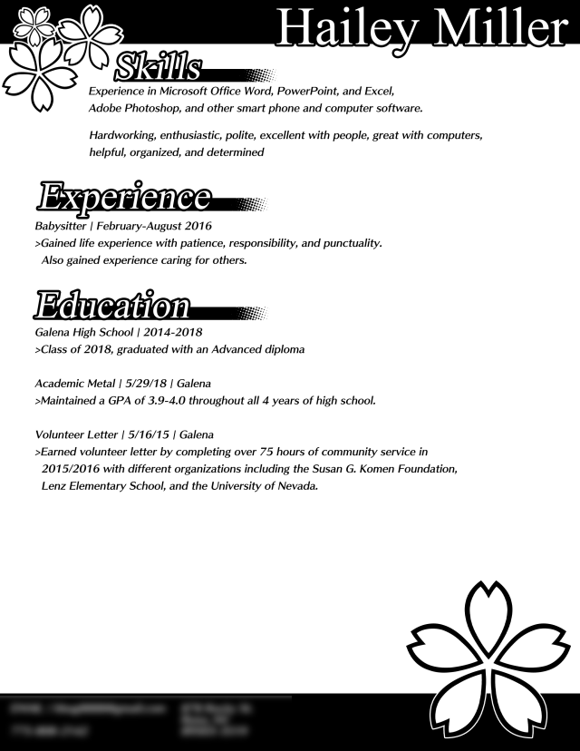
After
Fonts: Skip by fontworks and Mongolian baiti
A quick note. The images seen on the page are not images. They are actually unicode (UTF+8). ❀❀❀
Reflection:
1.Based off typography, the style of text can change how a person would interpret an emotion and their skills. For example, you could interpret mine as somebody with some professionalism and graphic skills, and the other person’s resume as a friendly and heartwarming. Text can also change this as well. Something flat like Sans serif will give a more modern design, with serif being a more classic style.
2.An audience is important for what you are making. You want to try to almost always have your ideas be oriented to an audience, with a fitting style and design to go with it as well. A more childish audience might like designs that have eye candy, where as a professional business or company would prefer something with a simple, cohesive design.
Resume Re-Design


Made by Kenny Choung and Hailey Miller
Things I saw today – Final

Photo of the internals of my new computer 
Froggy Chair。 
Wibdowsill from a parking garage 
???????? 
neat lookin bench 
UNR banner. Its shaped like nevada. 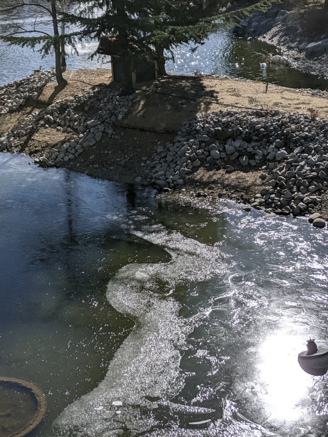
Half frozen lake. 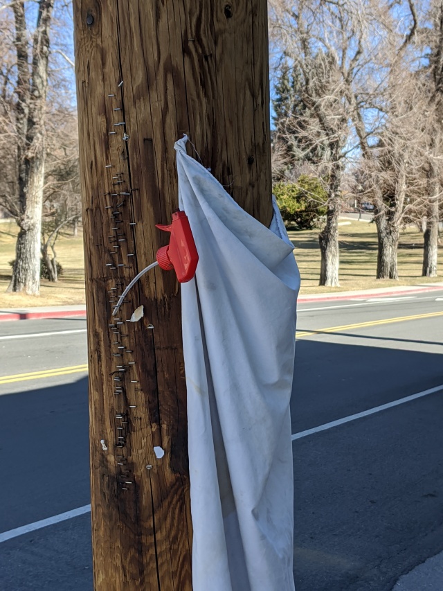
?!??!?!?? 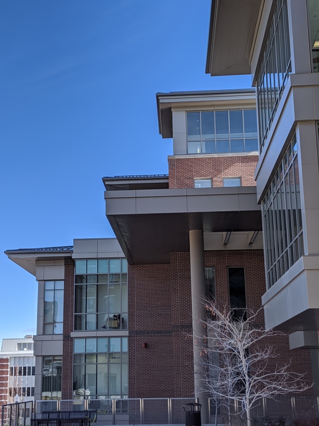
Side of a building 
spoopy exit wao
Things I saw today

Dango I made 
smol sushi plushes 
Boba tea 
spicy pizza 
Beef bowl 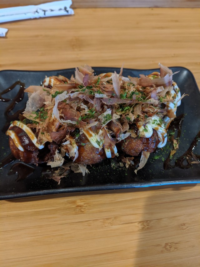
Takoyaki 
Spicy tonkotsu ramen 
Shoyu ramen 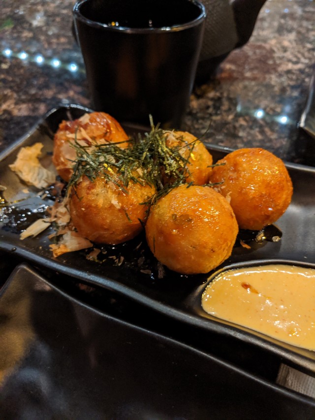
More takoyaki 
More shoyu ramen
Things I saw today + Layout & Composition
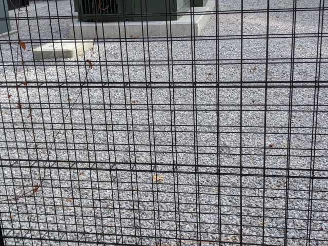
Shape – A fence that uses squares as the shapes for the cutouts. 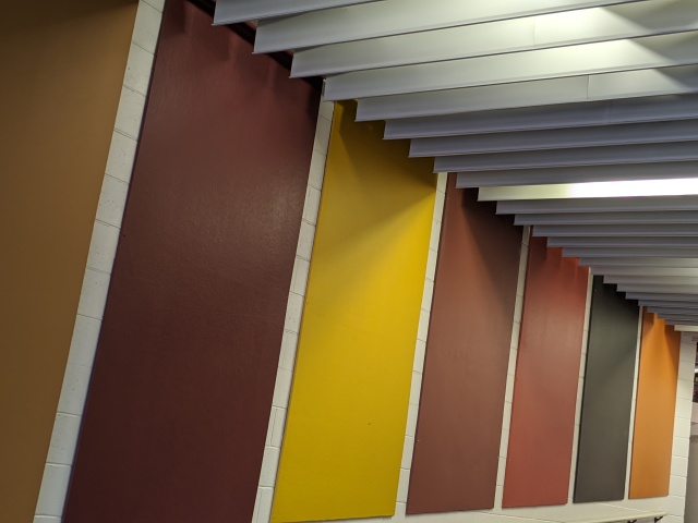
Color – All panels are complimentary, with each one being a warm color 
White Space – The holes in this panel contrast it. 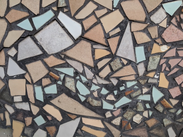
Balance – Several stones on a wall. None of them touch or get close to each other at all. 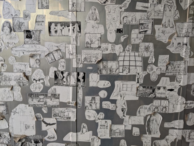
Tension – Several photos on a wall. Some are close, and some overlap. 
Contrast – The vent and the back support add detail to the image. 
Scale – Two cups 
Repetition – Several desks, all the same type, organized. 
Hiearchy – Your eyes look at MASTER BREW KOMBUCHA first, then KEVITA, then the bottom. 
Symmetry – The lights and the panel are all the same distance/position 
Asymmetry – The rocks are stacked haphazardly. 
Golden Section – The character on this cassette fits within the golden section. 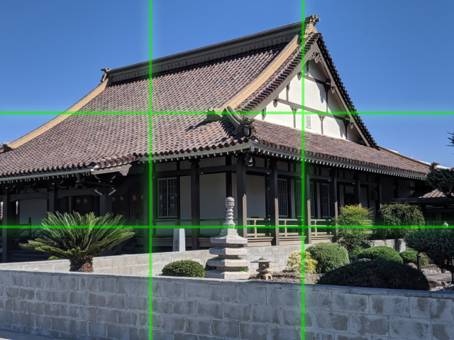
Rule of thirds – There are 4 spots on the building that catches the viewer’s eyes 
Grid – This gondola is organized in a 8×5 grid.
Things I saw today

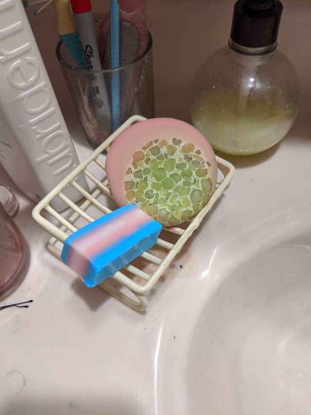
????????!? 
Soaps 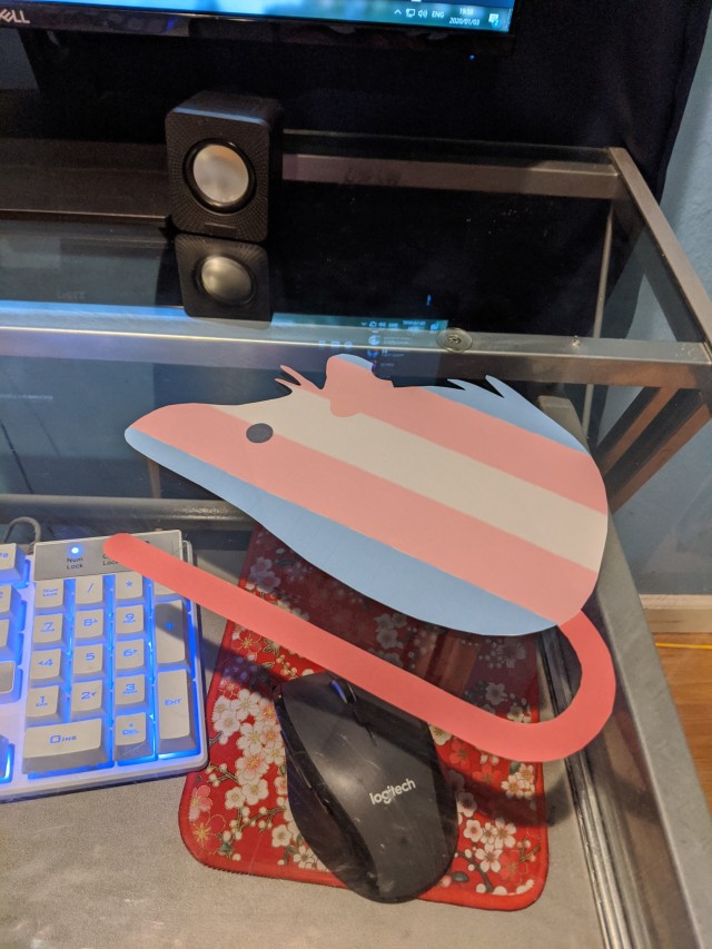
Trans rat. 
Claw machine 
Sushi 
Arcade game 
Ice cream 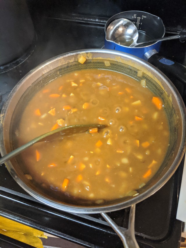
Curry 
Parappa Hat 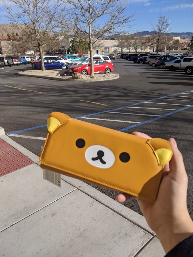
Manly Wallet
Things I saw today
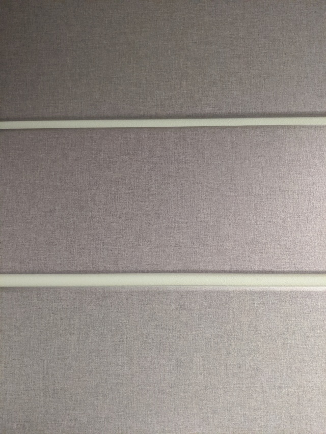
Wall with three different panels. 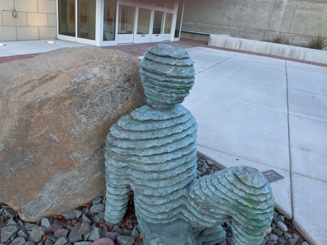
Statue outside of the knowledge center. 
Colorful bottles. 
“Cat Planet” vinyl decals 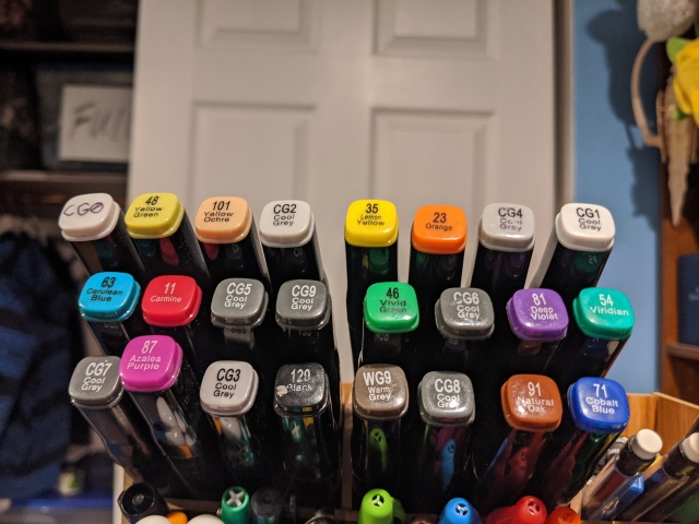
Alcohol markers 
Strawberry Ice i got from the market 
Assorted pens 
Fountain Pens. 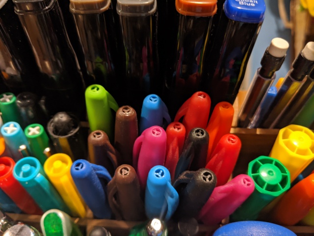
Pens 
Sharpies and pens

