https://drive.google.com/file/d/1F75h0vNeFBPCsLI-C1dpRvSVXeuXZFOL/view?usp=sharing
Tag: Assignments


Resume self re-design + another’s re-design

Before – Personal info is blurred out 
After – Personal info is also blurred out
Fonts used: Powerweld and sans serif

Before – Personal info also blurred out 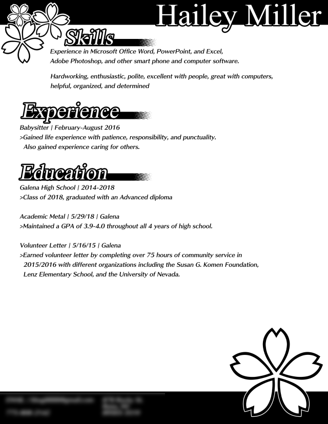
After
Fonts: Skip by fontworks and Mongolian baiti
A quick note. The images seen on the page are not images. They are actually unicode (UTF+8). ❀❀❀
Reflection:
1.Based off typography, the style of text can change how a person would interpret an emotion and their skills. For example, you could interpret mine as somebody with some professionalism and graphic skills, and the other person’s resume as a friendly and heartwarming. Text can also change this as well. Something flat like Sans serif will give a more modern design, with serif being a more classic style.
2.An audience is important for what you are making. You want to try to almost always have your ideas be oriented to an audience, with a fitting style and design to go with it as well. A more childish audience might like designs that have eye candy, where as a professional business or company would prefer something with a simple, cohesive design.
Resume Re-Design


Made by Kenny Choung and Hailey Miller
Things I saw today + Layout & Composition
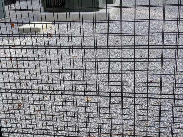
Shape – A fence that uses squares as the shapes for the cutouts. 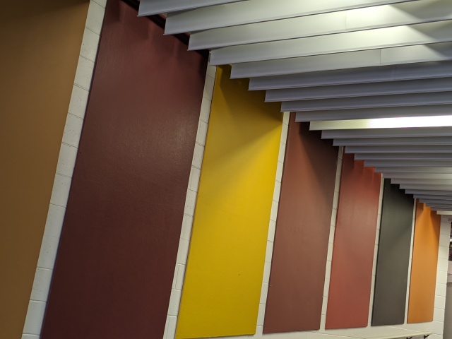
Color – All panels are complimentary, with each one being a warm color 
White Space – The holes in this panel contrast it. 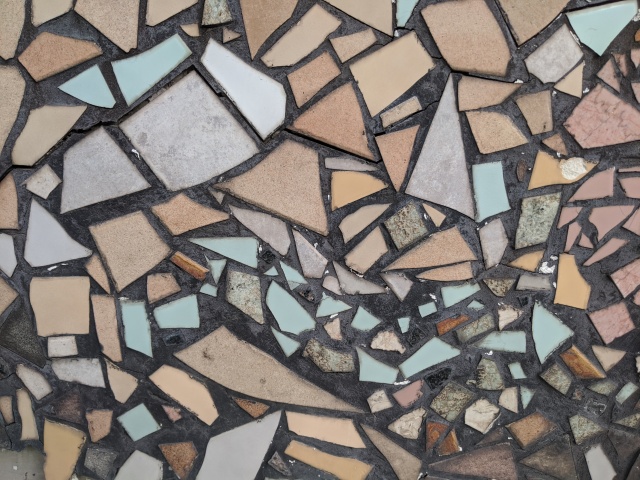
Balance – Several stones on a wall. None of them touch or get close to each other at all. 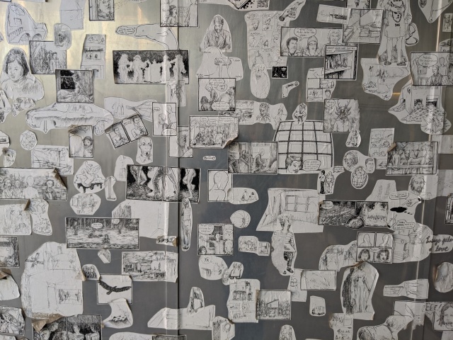
Tension – Several photos on a wall. Some are close, and some overlap. 
Contrast – The vent and the back support add detail to the image. 
Scale – Two cups 
Repetition – Several desks, all the same type, organized. 
Hiearchy – Your eyes look at MASTER BREW KOMBUCHA first, then KEVITA, then the bottom. 
Symmetry – The lights and the panel are all the same distance/position 
Asymmetry – The rocks are stacked haphazardly. 
Golden Section – The character on this cassette fits within the golden section. 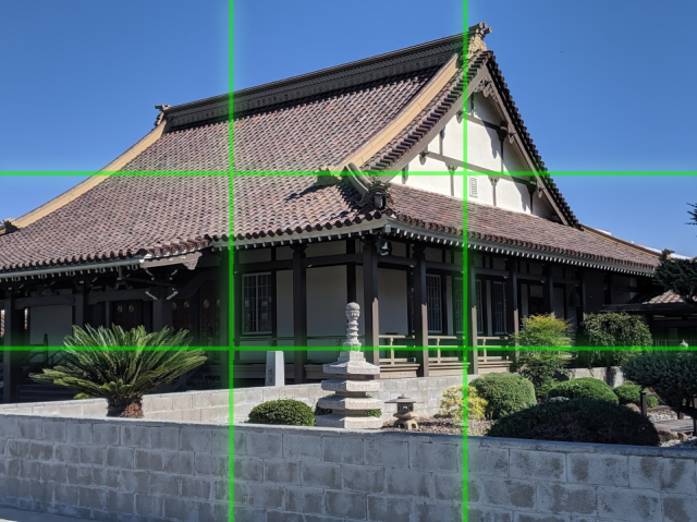
Rule of thirds – There are 4 spots on the building that catches the viewer’s eyes 
Grid – This gondola is organized in a 8×5 grid.
Theming – Choosing my own path
WordPress allows a variety of options to mess around and create sites with. Some of the options they provide make it easier to create sites, without any prior knowledge of design, thanks to themes.
While looking for themes, a good amount felt the same, with title on the top, and sub pages located right below. Despite this, they still give a great amount of freedom to mess around with your page.
When choosing a page, I decided to choose the [Lovecraft Theme], Since it offered a sidebar, and a good amount of room to put a photo. I ended up also theming it with more of a calmer approach.

There were issues that I encountered while making the page;
- Custom Style Sheets (CSS) and Hyper Text Markup Language (HTML) allow for further customization of a page, but were locked to being premium only.
- Despite providing Audio and Video, both of these are also restricted towards a premium account too.
- The theme still had a same feeling to all the other themes, due to the header and menu locations.
I managed to solve a good amount of these issues in the end. At first I tried other themes too, but either I couldn’t use an image as the background, I had no way to put items on the sides of the pages, or other reasons. I ended up creating several solutions to solve these problems.
- You might have noticed there was a song playing when you opened up the home screen. The song used is Potsu – Homesick. Its a “Lo-Fi” song. I was able to add it by using the Audio function, but instead of uploading the song, I was able to instead paste a URL. If you paste a youtube URL, it will end up linking a Youtube video instead of a song. So Instead, I uploaded the mp3 file online, and linked the song with the URL. this let me put music on the site without having to subscribe.
- WordPress allows you to put your menu at the side. The only problem with that is you need the menu at the top. There was supposedly no way to remove it, but by creating a menu category, and having nothing in it, you could remove the menu at the top and have the menu instead be at the side of the page instead.
In the end, I managed to break out of the restrictions that held me back with WordPress, and create a site that was more unique and less similar.

