Before – Personal info is blurred out 
After – Personal info is also blurred out
Fonts used: Powerweld and sans serif

Before – Personal info also blurred out 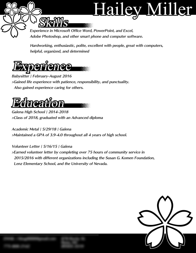
After
Fonts: Skip by fontworks and Mongolian baiti
A quick note. The images seen on the page are not images. They are actually unicode (UTF+8). ❀❀❀
Reflection:
1.Based off typography, the style of text can change how a person would interpret an emotion and their skills. For example, you could interpret mine as somebody with some professionalism and graphic skills, and the other person’s resume as a friendly and heartwarming. Text can also change this as well. Something flat like Sans serif will give a more modern design, with serif being a more classic style.
2.An audience is important for what you are making. You want to try to almost always have your ideas be oriented to an audience, with a fitting style and design to go with it as well. A more childish audience might like designs that have eye candy, where as a professional business or company would prefer something with a simple, cohesive design.